Admin User Guide
Building the Table of Contents
- The Table of Contents (TOC) that displays in the left-hand navigation is built dynamically. Just add a new page and it will appear in the TOC.
- To add a sub-page, create a new page and specify a “Parent” in the page settings. The sub-page will now appear in the TOC when the parent heading is clicked/expanded.
- If you don’t really have any content to put on the parent page, you can delete all the blocks from the page. If a parent page is completely blank, when a user clicks on the heading in the TOC, it will jump to the first sub-page (child page) underneath.
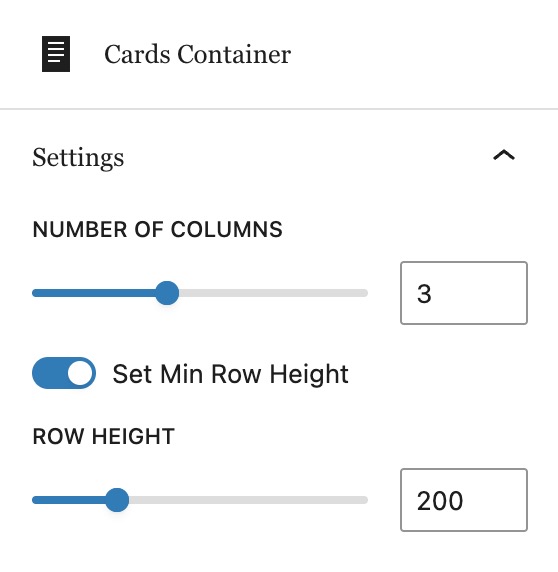
Cards Container Block
The primary block for laying out content is the Card Container. This block creates a grid into which Cards are added. There is not much to configure on the actual Cards Container block besides the number of columns. The row height can also be adjusted, but generally the default should work in most cases.
Card Block
Inside the Cards Container, you can add as many blocks as you want. Below are instructions for configuring two of the primary settings for a card:
- Its position in the grid
- The type of content it contains
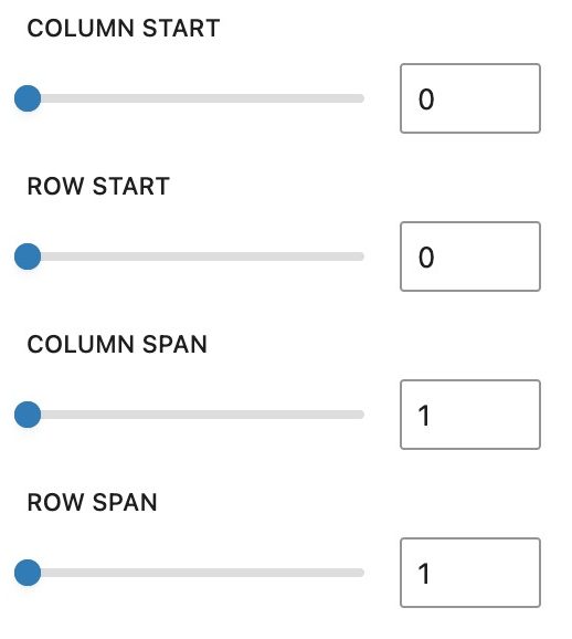
Cards: Position and Size
By default, cards will fill the grid as you add more. But you have the ability to control how much space they take up and where they appear by adjusting these settings:
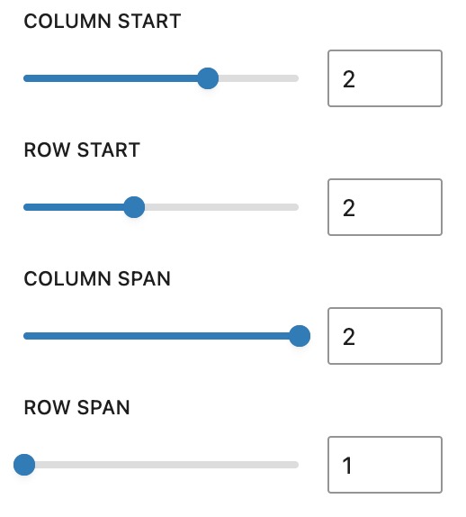
Example: If you want the following layout…
You would configure the last card to start in the 2nd column, and have it “span” two columns, as follows:
Cards: Content options
The card block has 4 pre-configured styles: Default, Text, Image Fill and Video.
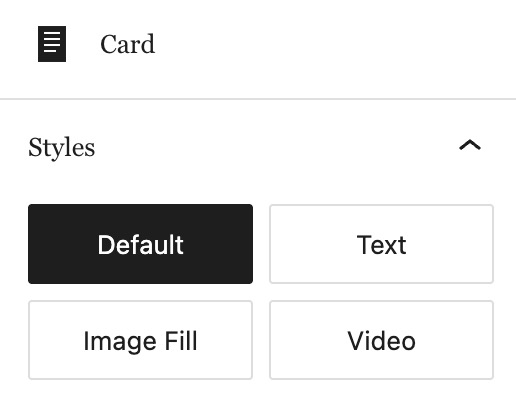
Text, Image Fill and Video styles are straight forward. Choose the style you want for the card, and then add the corresponding blocks to the card.
Below is a Card Container with three cards of those varieties. You can edit this page and explore the blocks to see how they are set up.
Tip: Always open the “Document Overview” by clicking the icon with three lines at the top of the Editor screen. This make it easy to see an outline all of the blocks on the page.
Example with cards for Text, Image Fill and Video
Card with Text
This is sample text
And it continues with this paragraph.
The Default style for a card is general and versatile. It has the ability to set a background color for the card. Text or image blocks can be added to a card, giving a variety of options.
Example of cards using the Default style
Lorem ipsum
Lorem ipsum